Yardly: A Case Study in Fostering Local Community
Designing a mobile app to help urban residents build meaningful connections in their immediate vicinity. Project Overview
The Problem
In today’s fast-paced urban environments, residents often feel a sense of isolation and disconnection from their local community. It’s difficult to know about neighborhood events, support local businesses, or even meet the people living next door. This lack of a central, trusted digital space leads to missed opportunities for connection and community building.
The Goal
Our objective was to design an intuitive and engaging mobile application that serves as a one-stop hub for neighborhood life. The app aims to increase community engagement, promote local businesses, and strengthen neighborly bonds by making local information accessible and actionable.
My Role & Responsibilities As the lead UX/UI Designer on this project, I was responsible for the end-to-end design process, including:
-
User Research & Analysis
-
Information Architecture & User Flows
-
Wireframing & Prototyping
-
Visual Design & UI Kit Creation
Usability Testing
Timeline: 8 Weeks (Concept Project) Tools: Figma, Miro, Google Forms Discovery & Research
To understand our users’ needs, I conducted a mixed-methods research approach, including a survey of 50 urban residents and in-depth interviews with 8 individuals.
Key Findings:
72% of participants wished they knew more about local events.
65% felt they didn’t have an easy way to ask for recommendations from neighbors.
Safety and trust were major concerns when considering sharing information or items with neighbors.
Based on this research, I created a user persona to guide my design decisions.
User Persona: Maya, The New Mover
-
Age: 31
-
Occupation: Graphic Designer
-
Bio: Maya recently moved to a new city for a job. She’s friendly and wants to explore her new neighborhood, find a good local coffee shop, and maybe join a book club, but she doesn’t know where to start.
-
Frustrations: Feels like an outsider; finds it hard to meet people outside of work; overwhelmed by generic city-wide event apps.
-
Goals: To feel safe and at home in her new neighborhood; to support local businesses; to meet like-minded people nearby.
Ideation & Design
User Flow
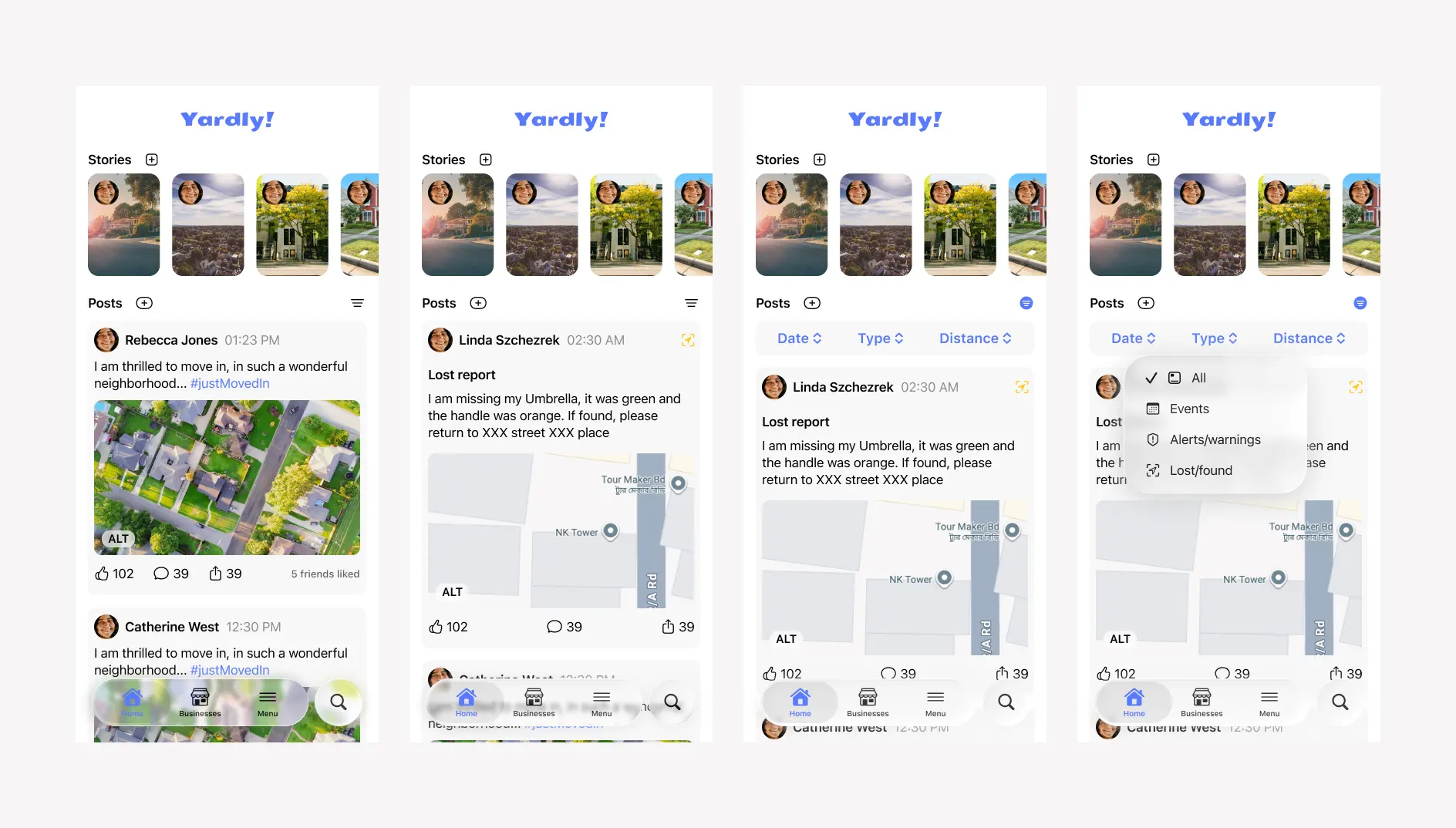
To ensure an intuitive experience, I mapped out the primary user flow for a key task: finding and RSVPing for a local event. This helped clarify the necessary screens and interactions.
| Step | User Action | Screen / UI Element | Description |
|---|---|---|---|
| 1 | Opens the app. | Home Screen | Maya lands on the main feed, which shows a mix of all post types from her neighborhood. |
| 2 | Taps the “Filter” icon. | Filter icon | To find specific content, she taps the filter icon at the top of the screen. |
| 3 | Taps the “Type” button. | Filter Options | A filter bar appears with several filter options. She taps on “Post Type”. |
| 4 | Selects “Events” from the menu. | Pop-up Menu | A list of post types appears. She selects “Events” to narrow down the feed. |
| 5 | Applies the filter. | Filter Options | The filter is applied. |
| 6 | Views the filtered feed. | Home Screen | The home feed now exclusively shows upcoming events. She scrolls to browse. |
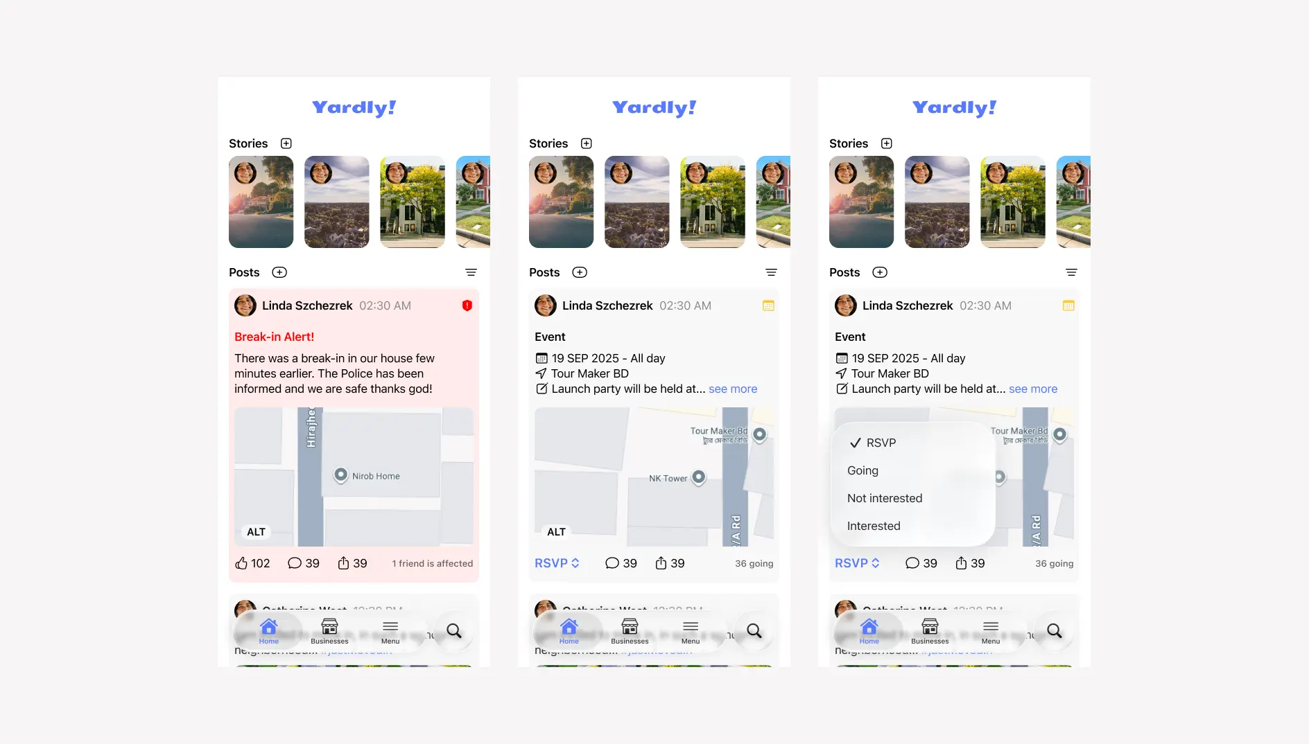
| 7 | Taps on “Launch event”. | Event Card | An event catches her eye, and she taps to see more details. |
| 8 | Reads event details. | Event Details Screen | She reviews the full description, time, location on a map, and sees who else is going. |
| 9 | Taps the “RSVP” button. | Primary CTA Button | Confident she wants to attend, Maya taps the clear call-to-action button. |
| 10 | Receives confirmation. | Confirmation Modal / Toast | A message appears confirming her RSVP. The button text changes to “✓ Going” and an option to “Add to Calendar” is presented. |
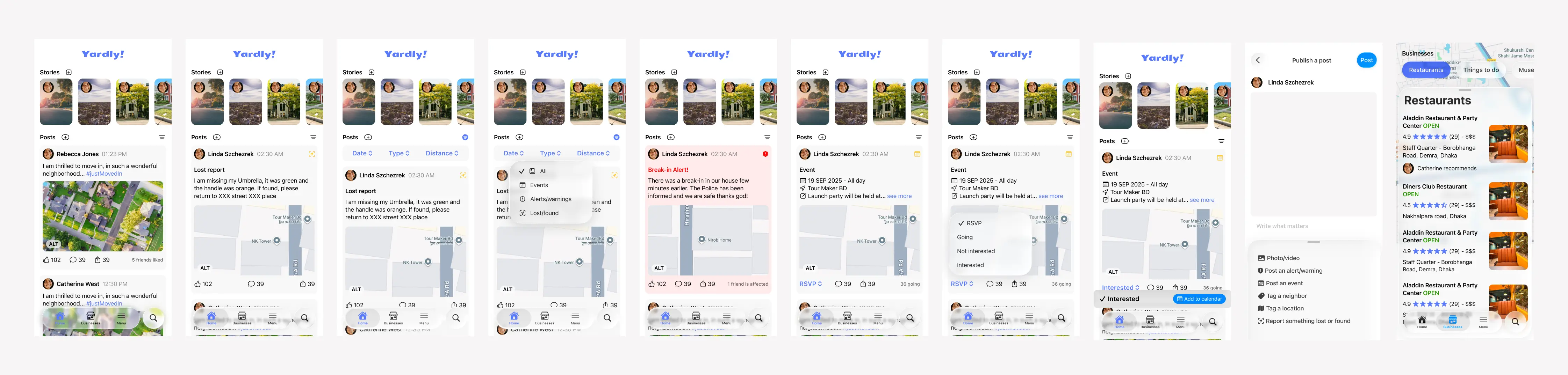
Wireframes
I began with low fidelity sketches in Figma
First iteration
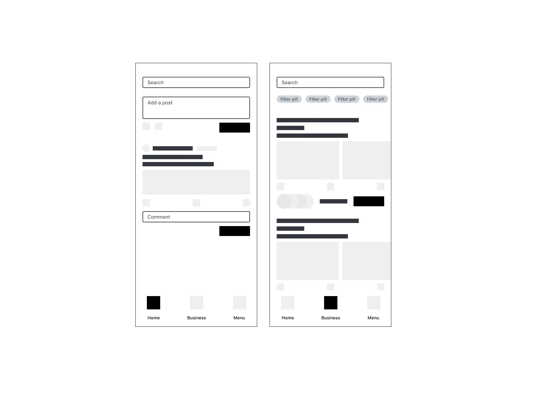
Second attempt
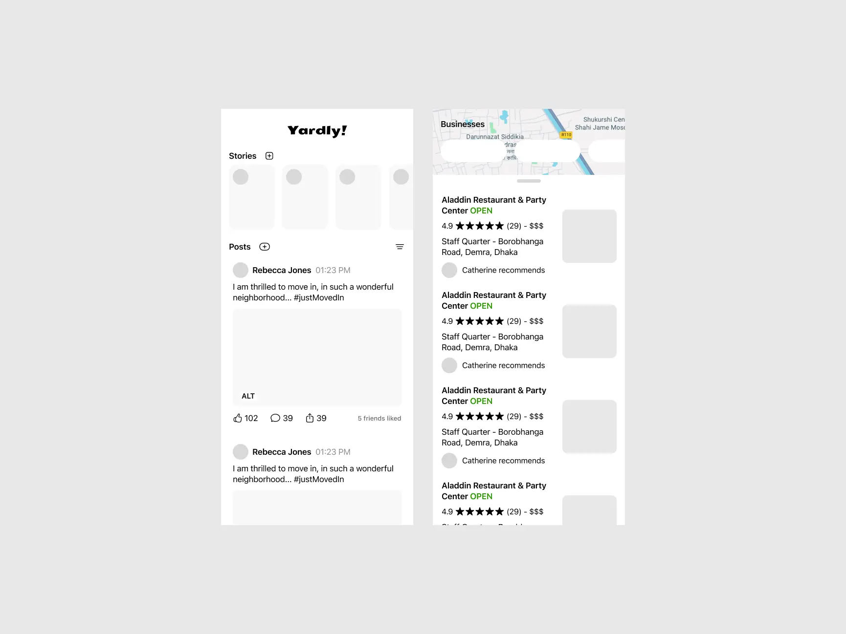
Final design
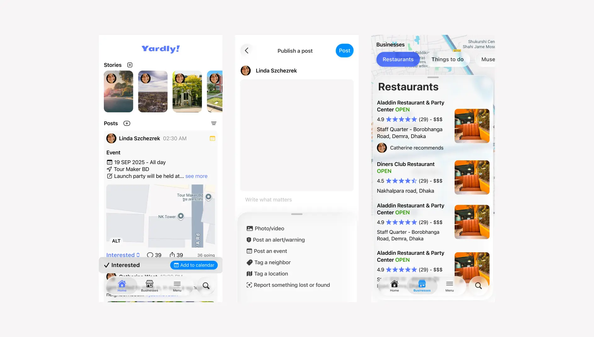
The Final Solution
The final design is a clean, intuitive, and feature-rich application that empowers residents to connect with their community. The key screens below showcase the refined visual language and user-centric layout. Learnings & Next Steps
This project reinforced the importance of basing design decisions on user feedback. The iteration on the “Post” button was a small change that significantly improved the user experience.
Next Steps:
If I were to continue this project, I would focus on:
-
Developing a Business Portal: Creating a dedicated interface for local business owners to manage their profiles and post special offers.
-
Gamification: Exploring features like community badges to encourage positive participation and reward helpful neighbors.
Thank you for reading!